

Time Frame
October 2023 - February 2024
Partners
Jana Schäffner, Alejandra Guelmes
Supervision
Sandra Raab
Tools


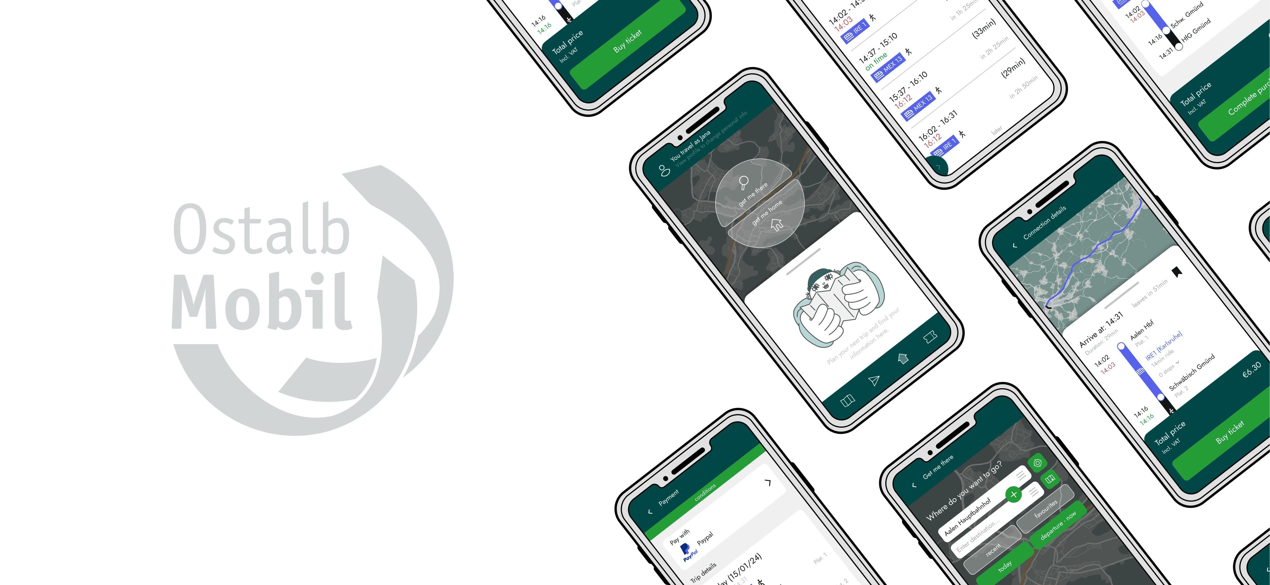
The project is a redesign of the OstalbMobil app, which is used to navigate public transportation in the Ostalb region of Germany. We identified several problems with the current app, including inconsistencies, unclear navigation, and confusing usability. In particular, it lacks critical features such as ticket purchasing. Our redesign aims to improve the user experience and increase overall functionality.
Research
Competitor Analysis
Interviews
Graphics
Illustration
Icon Design
Storytelling
Planning
Videography

Current App We conducted a thorough analysis of our app, as well as several other public transit applications. We synthesized our findings and focused on the most important aspects that stood out to us. We then voted together to prioritize the most important areas for improvement, which shaped our roadmap for improving the OstalbMobil app.
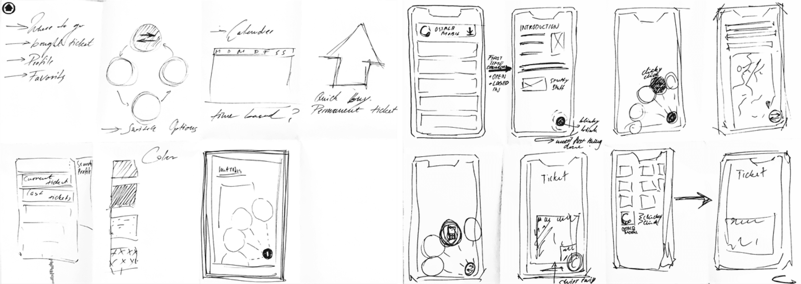
Ideation With the foundation in place, we began the actual design process. To foster creativity and quickly generate a variety of ideas, we kicked off with a series of "Crazy Eights" sessions. Each iteration of Crazy Eights was dedicated to a specific "how could we" question, allowing us to explore different perspectives and potential solutions. This dynamic brainstorming technique provided us with a rich pool of creative concepts to build upon as we embarked on the next phases of our redesign.
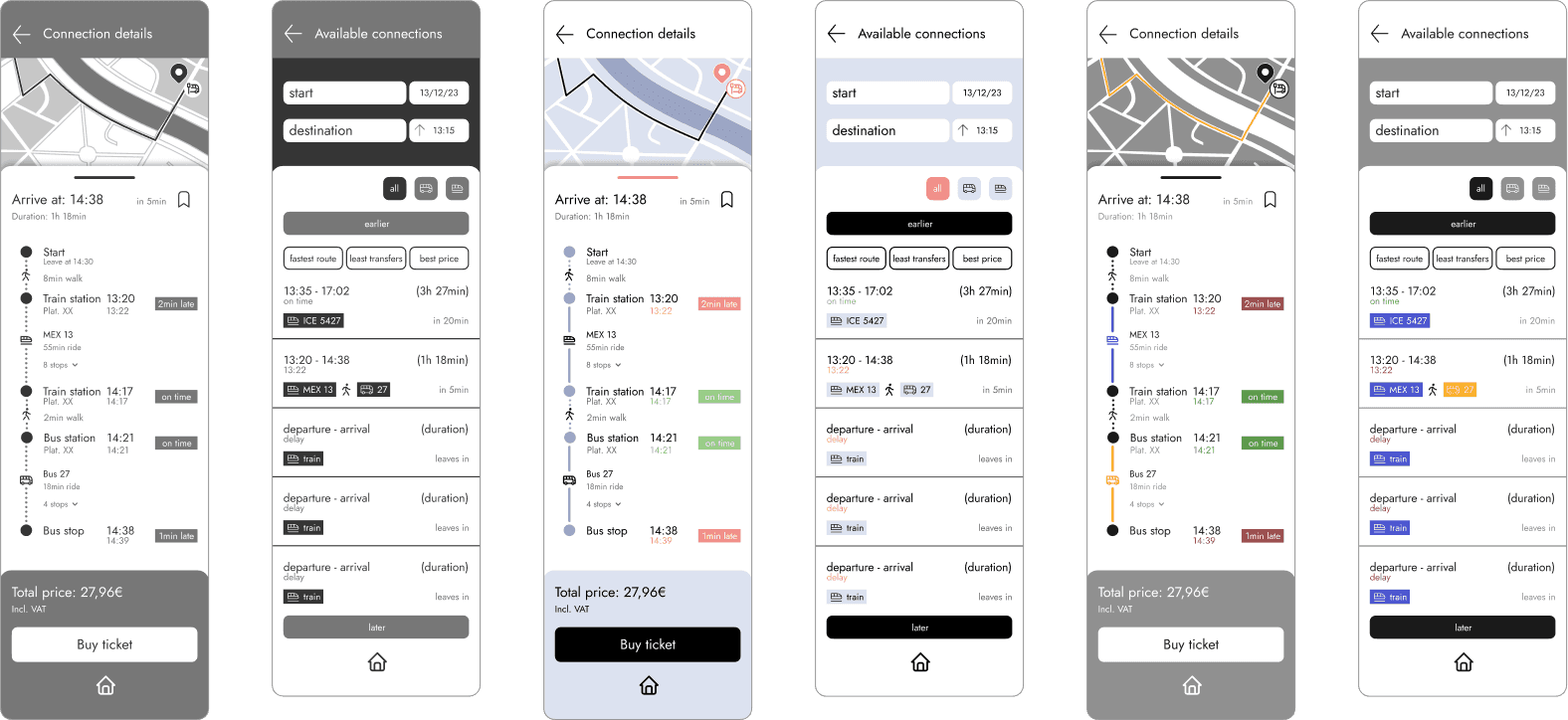
Design Variations We strategically selected keyframes to create design variations, promoting efficiency and visual cohesion. This disciplined approach provided a clear roadmap and accelerated development. The chosen design variant established a consistent visual language across all screens, ensuring the overall cohesiveness and efficiency of our project.

Styleguide We integrated the two greens from the original app, creating a visual bridge to familiarity. To complement these, we introduced additional colors chosen to harmonize with the existing palette. Some stand out for their color coding and feedback, enhancing the user experience throughout our UI.
Our custom icon set was designed by us to match our typography. With careful attention to line thickness, font characteristics, and symbol integration, our icons provide visual harmony. Our decision to create our own illustrations also allows us to tailor the visuals to our unique design language, fostering a more personalized and cohesive user experience.
Final design Step by step, we finalized each screen for our use case, following the established guidelines. Our final app redesign emerged through further iterative processes and continuous refinement, embodying a thoughtful and purposeful evolution.
This project had a clear process with defined steps. Although I really enjoyed working in the group and am happy with the result, I was missing a little more freedom to develop more. In the end, I found my place in designing icons and illustrations.